

Csilla Herendy[1]: How to Research Website Usability and User Experience in Public Administration Websites? (Publico, 2017/3., 270-289. o.)
Abstract
The users (citizens) need well designed, easy-to-use and usable websites, but in most countries they have difficulties orienting and using public administration websites. This paper tries to unfold the possible basics of the problem. Some available and tried testing methods are presented, which are useful for testing the websites. Case studies are also shown from the field of public administration, which are based on the author's academic research conducted in Bologna, Italy (2010) and in Hungary (continuously since 2009); these were tested with different testing methods. The examples presented in this study show that the websites of the government and the city governments do not work without systematic user testing, particularly the investigation of the mental models. This paper is based on the author's presentation at NKE-WUD 2015 conference in Budapest.[1]
Keywords: card sorting test, mental model, eye-tracking research, paper prototyping, online focus-group, testing methods, website usability
- 270/271 -
1. Introduction
It is a basic phenomenon that clients/citizens need well designed, easy-to-use and usable websites. It is also observed that the citizens often do not like to use websites of the public administration sector because their surface is complicated, hard to understand and sometimes neglect actual user expectations and needs.
Typical user problems are the following: they do not understand the public administration and legal phrases that are used there, they do not see the structure (information architecture) of the website, and the logical relations between topics.
The sites are often not stylish, and unfortunately absolutely not cool. Just think of the welcoming words of the mayors, or the excessive amount of unnecessary information on the main pages, which do not reflect the users' needs. The main pages often give outdated information and do not reflect the users' real information needs.
Flash intros are also sometimes used, which is a problem for users whose browsers cannot download the flash - they cannot even enter the webpage. Responsible designs are also rarely used, which means mobile-friendly versions are also not available. The mobile-friendly versions are particularly important because the majority of the user population is young and they meet websites first on mobiles.
As a result, users have difficulties navigating on given sites, they soon lose their patience, and it often happens that they rather choose personal, instead of electronic, administration, which does not help the spread of e-government.
There are some reasons for the problem, e.g. the obsolete design strategies, which neglect the users' point of view and reflect the mental models of the officials. The development method is also often outdated: it starts with beautiful design in Photoshop/jpeg pictures and the content must be adjusted to it; otherwise the design will be subsequently modified again and again. The sites are tested rarely and/or in the wrong way.
This can happen because of the lack of experienced professionals (the site is developed in-house by IT developers) and because of harmful development practices.
Another problem is that the content, wording and structure of the site reflects the mental models of the officials and there is a mismatch between the mental models of the citizens and the website owner (employee in public administration/programmers).
- 271/272 -
1.1. Definition of usability and ISO-standards[2]
Usability means making products and systems easier to use, and matching them more closely to the user needs and requirements.
The international standard, ISO 9241-11, provides guidance on usability and defines it as:
"The extent to which a product can be used by specified users to achieve specified goals with effectiveness, efficiency and satisfaction in a specified context of use."
Usability is about:
- Effectiveness - can users complete tasks, achieve goals with the product, i.e. do what they want to do?
- Efficiency - how much effort do users require to do this? (Often measured in time.)
- Satisfaction - what do users think about the products' ease of use? ...which are affected by:
• The users - who is using the product? e.g. are they highly trained and experienced users, or novices?
• Their goals - what are the users trying to do with the product - does it support what they want to do with it?
• The usage situation (or 'context of use') - where and how is the product being used?
"There isn't actually an international standard for UX design, but there is an international standard that includes concepts like human-centred design, usability, accessibility, and the measurement of user satisfaction. This standard aligns directly with the goal of UX practitioners."[3] The title of the "UX" standard is ISO 9241 Ergonomics of Human-System Interaction. The ISO part of the name means it is from the International Organization for Standardization and applicable worldwide, which is the network of over 160 national standards bodies. It is by far the largest and most collaborative standards body in the world, having created nearly 20,000 standards to date.
ISO Standards related to usability can be categorized as primarily concerned with:
- The use of the product (effectiveness, efficiency and satisfaction in a particular context of use);
- the user interface and interaction;
- the process used to develop the product, and the capability of an organization to apply user centered design.
All of them can be useful at the website development process, especially because usually there are no specified laws in countries about the usability of public administration's websites.
- 272/273 -
1.2. What is a Mental Model?
"The first person to talk about mental models was K.J.W. Craik in his 1943 book, The Nature of Explanation.[4] After its publication, the concept of the book was dormant for many years, until the 1980s when the term reappeared. In the 80's, there were two books published with the title Mental Models."[5] Susan M. Weinschenk wrote that - since that time (since the 80's) - there are many definitions for mental models that have been around for at least 25 years.
One of Weinschenk's favourites is from Susan Carey's 1986 journal article, Cognitive Science and Science Education which states: "A mental model represents a person's thought process for how something works (i.e. a person's understanding of the surrounding world). Mental models are based on incomplete facts, past experiences, and even intuitive perceptions. They help shape actions and behaviour, influence what people pay attention to in complicated situations, and define how people approach and solve problems."[6]
The importance of mental models is highlighted by various studies such as Indi Young's Mental Models: "Mental models give you a deep understanding of people's motivations and thought processes along with the emotional and philosophical landscape in which they are operating"[7] or Don Norman: "A mental model is what the user believes about the system at hand." He empathizes, that "mental model is based on belief, not facts, it is based on their predictions about the system and a mental model is internal to each user's brain, and different users might construct different mental models of the same user interface". He added, "one of usability's big dilemmas is the common gap between designers' and users' mental models. Because designers know too much, they form wonderful mental models of their own creations, leading them to believe that each feature is easy to understand. Users' mental models of the UI are likely to be somewhat more deficient, making them more likely to make mistakes and find the design much more difficult to use".[8]
People always have mental models, but they are different. People create mental models very quickly and change them very quickly. Yet it is important to research these models. The aim of the research is to understand people's (e.g. the target audience's) mental models.
- 273/274 -
1.3. How could we make it better?
If the website's strategy is based on research, the website will meet the needs of the citizens. Research helps align the needs of people with the mandate of the organization. While research helps drive strategy, it is important to note that most people do not know how to articulate what they actually need. To quote Henry Ford: "If I asked people what they wanted, they would have said a faster horse." That is is the reason why the organization needs to conduct different research studies, to clarify the users' thinking (mental models) and find the underlying needs and motivations that prompt participants to propose certain features, functions or approaches.
If the public administration gets to know better the citizens' mental models and use them as the basis for its websites, the people will more likely use it. This in turn helps the spread of e-administration, with all its advantages.
There are some useful research methods, which can be helpful while gathering information about the user's mental models. Some widely used methods for gathering information are the card sorting test (open card sorting, closed card sorting), focus groups, interviews, surveys, questionnaires, participatory design or usability testing. Although these methods are usually helpful for accessing mental models, there are some limitations to isolating and studying mental models. The researcher should choose the one which fits to the actual goals.
2. Methods and Materials
There are several methods during the website development process that helps understand the user's need, creating understandable information architecture, which fits the user's need, and testing the actual surface. In order to avoid UX-fails - badly usable website, incomprehensible or confused information architecture etc. - there are a whole bunch of research techniques which can be used throughout the whole development process.
There are some technics in the table (Table 1) below, which can be used at the proper stage of the development process. Only the name, strengths and weaknesses of them are collected and listed, but the author expounds three methods in detail later on.
- 274/275 -
Table 1 Table of UX Techniques
| Technique | Strengths | Weaknesses |
| Analytics | - Quick way to determine areas of interest in the way users interact with existing products. - Enables you to focus other research efforts. | - If you have no data you cannot use analytics. - If there is a very limited budget, analytics can prove expensive. - You can discover the "what's happening" but not "why it's happening". |
| Benchmarking | - Very useful in highly competi- tive markets. - Can help you quickly become familiar with a new industry or sector. | - Time consuming and may interfere with short deadlines. - May offer little value if you are already familiar with the industry or sector. |
| Contextual research | - The best way to determine how users behave in their own environment. | - Cost and time intensive and will not suit projects with low budgets and/or tight deadlines. |
| Customer experi- ence mapping | - It lets you quickly see when a product fails to meet user expectations. | - Cost and time intensive in some cases - a lot of research required to be effective. |
| Expert reviews | - Quick, cheap technique to get a high level understanding of an existing product's issues. | - Does not provide any deep insight into the users. |
| Guerrilla usabi- lity tests | - Good low budget solution to get users interacting with the design. | - Poor solution if you want to involve clients in user testing. - Very specific and may miss broader issues. |
| Ideation workshops | - Develops a shared project vision for UX. - Brings input from all affected parties early in the process. | - If a client prefers to be "hands off" they may not want to participate. |
| Information architecture | - Must be done for all projects in some form. | - Scope of work varies signifi- cantly with the complexity of a project. |
| Lab usability tests | - Gets client input into usabi- lity tests. - Allows you to keenly observe users. | - Expensive and will not be good for a small budget. - The act of creating an artificial environment may influence outputs. |
- 275/276 -
| Technique | Strengths | Weaknesses |
| Paper prototyping | - Allows you to test a product thoroughly prior to production. - Creates quality inputs for user testing. | - Expensive and time con- suming - not good for small budgets or tight deadlines. - Overly complex proto- types may require significant adjustments. |
| Requirements, planning, workshops | - The best way to understand highly complex projects, cli- ents and teams. | - Heavy resource requirements and may not be useful for small budget/tight deadline projects. |
| Sketching | - Cheap and effective for getting quick feedback on ideas. | - May not be well received by clients if they are used to seeing higher quality work during the design phase. |
| Stakeholder interviews | - Good for getting input from key figures on a project. - Good for developing a tho- rough project understanding. | - Time consuming and may be inappropriate for tight deadlines. - Bad for making decisions on design - too limited scope of input. |
| Surveys | - Collecting lots of information quickly. - Gathers both qualitative and quantitative data. | - Data may be flawed. - Analytical efforts can be time consuming and expensive. |
| Task modelling | - Gives a high degree of confi- dence in the UX. - Gives strong insight into the process at the user level. | - Can be expensive and time consuming. |
| User journeys | - Great for simplifying pro- cesses. for the user. - Ensures all essential tasks will be completed. | - Pointless for single-step tasks. |
| User personas | - Models a generic user to give all project members insight into user expectations. - Develops a greater level of user understanding during development. | - Should not be used as a substi- tute for contact with real users. |
| Wireframes | - Offers a deeper level of insight into design with users than sketching. - Helps develop a clear under- standing of project direction with users and clients. | - Limited use in highly complex products where prototyping may be essential. |
Source: International Design Foundation. www.interaction-design.org/courses/user-research-methods-and-best-practices
- 276/277 -
2.1. Interviews
It is always useful to start the whole design process with interviews with stakeholders of the project. External and internal stakeholders should be also identified. A stakeholder can be anybody with influence to cover the project, e.g. people who are working at the organization, civil servants, citizens, NGO's etc. It is as also important to identify UX stakeholders of the project, e.g. UX researchers, UX leads, designers, users. The number of interviews depends on the project budget.
2.2. Card sorting test
"Bad information architecture causes the majority of outright user failures"[9] and the biggest challenge of the website-developing process is creating useful, clear and easily understandable information architecture.
There is a very simple testing method which can help create the information architecture of the website. The basic idea of it sounds very simple: "... write content ideas on index cards and ask people to make groups out of them".[10]
Basically there are two types of card sorting test, open and closed. We can ask people to sort the cards (content) info piles according to what is similar and later on name the groups they make. This is called open card sorting test.
We can decide to give people cards and a set of categories and ask them to sort cards into the predetermined categories, this is called closed card sorting test.[11] After the test, the researcher should record the results, analyse the outcome and use them.
- 277/278 -
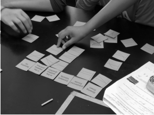
Figure 1 Closed card-sorting test in progress
Source: https://twitter.com/kellyoshea
2.3. Paper prototyping research
Paper prototyping is a simple and very cost friendly research method, which involves simple hand drawn sketches of interfaces. "It can be applied during the initial stages of development before any graphic or programming work is undertaken."[12]
The test session requires not only sketched interfaces and test subjects, but a human computer too, who is responsible for acting as the computer when the participants interact with the paper screens. The advantages of the technique are: it is time efficient, cost-friendly and available for everyone. But the biggest advantage is that users are more likely to give you honest feedback if they can see and use a hand drawn picture which indicates that you did not invest too much energy of work in a prototype.[13] That is the reason why it is better to use very simple pictures at the early stage of the design process. Moreover, the testing material is easy to change with an eraser and pencil.
Mock-ups, wireframes and (paper) prototypes can also be used to demonstrate and test the product's functionality.
- 278/279 -
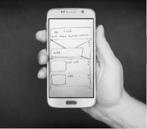
Figure 2 Paper prototype on mobile
Source: Picture by Csilla Herendy at http://ergomania.eu/paper-prototype-fidelity/
3. Some Best and Instructive Practices
In this chapter the author presents some of the public administration websites the development of which were based - at least partly - on the users' needs, habits and thinking. Among the design process, their developers have gathered client requirements, conducted online survey research, analysed user statistics and carried out card sorting tests. These methods are more and more used on a daily level in the business world, while they are less frequently used with public administration portals. Instructive practices are also presented, which neglected the users' need.
3.1. Kormany.hu where testing is a budgetary question
Dániel Kapi-Szabó from kormany.hu informed the author about the website development process of kormany.hu in 2016. It was said that the design of the page started in 2010, and it was activated in 2011. The main aim of the page was to replace the earlier structure, divided into ministries, with a homogeneous surface where the citizens can find all information materials and news, as well as everything regulated by law. He considered this solution both cost-efficient and user-friendly. The target group of the page is all Hungarian citizens.
About the development process, Kapi-Szabó said that they designed the structure first, simultaneously with the graphic design. The necessary developments were completed while uploading the first contents - "as usual". Members of the target group were not included in the
- 279/280 -
development process; the page was continuously tested by the editors of kormany.hu during the developmental stage (frontend and CMS system). This way of testing is not recommended because the mental models of citizens are different from the mental models of the editors of kormany.hu. Even after the start, the page ran in Beta version for several months.
As to the question about testing with the users, Kapi-Szabó said "a full pilot cannot be conceived for such a complex administrative surface where we continuously get new needs and functions to integrate into it. In a technical sense, the support professionals test and manage the page and the CMS system separately from the functioning surface". "The editors of the page are faced continuously with new challenges by the changes in technology and web design; [...] they try to be up to them, but the present big challenges, i.e. responsively, involve budgetary decisions", explained Kapi-Szabó.
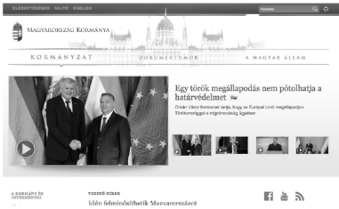
Figure 3 Website of the Government of Hungary
Source: www.kormany.hu, March 2016
3.2. Budapest, website of the 13[th] District: innovative development and testing methods, time standing result: www.budapest13.hu
The author researched the preparation of the site in 2010. The observed design methods were outstandingly innovative among the districts of Budapest at the time.
Redesign of the older site was taken up in 2009. A purpose articulated during the redesign was to have the most often searched functions on the main page, highlighted by topics (thematic directory), possibly using the names by which they are searched by the users. This was not a typical practice in Hungary then, nor is today, so it was necessary to get to know the needs of the users.
- 280/281 -
Before the redesign, they assessed the most popular content of the existing site. The goals were the following: to explore the most popular content, to get to know the typical user behaviour, to learn which are the typical searches and to identify the best way to phrase the highlighted themes so that they are unanimously identifiable by the users.
The following methods were used:
1. Analysis:
Connected to the analysis results, the most popular content were office hours, contact details, and institutions in the district.
Most district residents turned out to be visiting with the aim of settling some affair, and typical visits were short and to the point.
2. Google statistics:
The most popular search words were researched and the results were: office documents, jobs, contact information, driver's license, management, ID.
3. Online survey research:
In this research the users were asked to tell the goal of their visit in their own words.
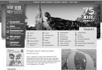
Figure 4 Website of Budapest, 13[th] District
Source: www.budapest13.hu, September 2013
Results:
The survey and the analysis were helpful in designing not only the structure, but also the phrasing of the content with a view to the thinking of the users when setting up the website. On the main page of the finished site we find the most often searched functions highlighted by topics, possibly with the names by which they are/were searched by the users.
- 281/282 -
3.3. Province of Emilia-Romagna, Italy, Bologna: team work of nine districts
The author researched the websites of Bologna and the province of Emilia-Romagna in the autumn of 2011, as an invited researcher of the University of Bologna.
A brief summary of the study conducted at the time (2011), with a view to the aspects that make the setup of the websites of the city and the districts illuminating.
Bologna has nine districts. The districts and the city do not have different sites designed independently and developed at a high cost. Instead, they had sites set up centrally, based on the same layout at the time the study was completed.
On the website of the city, whenever they can (but rarely due to the compulsory use of official language), they follow the non-official phrasing used by locals.
The site was not tested, but they do (did) take into account the ample feedback from users.
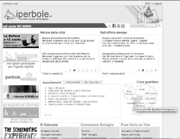
Figure 5 Bologna's website
Source: www.comune.bologna.it/, January 2012
The site was redesigned in 2012, and during this process, they worked together with the districts and took into account the opinions and observations articulated by them.
- 282/283 -
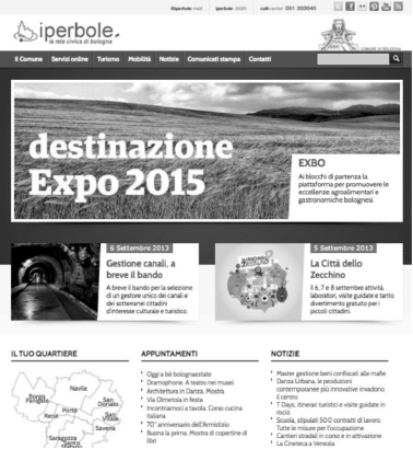
Figure 6 Bologna's website after the redesign
Source: www.comune.bologna.it/, September 2013
3.4. Gov.uk: best practice ever. Tested continuously with several methods
The Government Digital Service wrote about how they did the first iteration of identifying user needs: they started with the users' needs, asking around 1,800 individual users about their needs (or "tasks"). After this they prioritized and formatted these needs, using card-sorting tests among other methods. They ended up with around 950 needs. Further tasks mentioned include: product analytics, highlighting explicit and implicit user feedback and giving access to A/B test results.
- 283/284 -
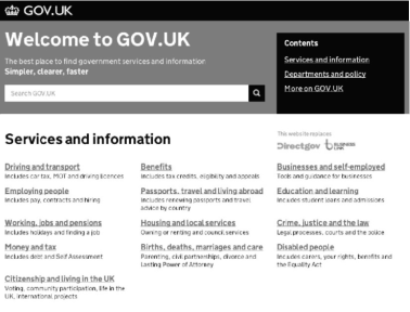
Figure 7 Website of the Government of the UK
Source: www.gov.uk, September 2013
The government is doing some top-notch user experience design for their websites right now. The structure and attitude of the website is exemplary for the government of several countries.
However, the government not only builds a website and publishes the methods of its creation, but they are also teaching everyone how they do it. If somebody is curious about user experience design, this is a great starting point.
All of the most important parts of a great design are mentioned:
- Start with user needs, reduction;
- validating assumptions;
- desire paths;
- A/B testing;
- prototyping;
- colour coding;
- making stuff look simple vs. making stuff easy to use;
- iteration;
- minimum viable products;
- Alpha and Beta (AB) testing;
- avoiding massive specs;
- accessibility;
- sticking to existing mental models, contrast;
- information design, consistency, typography, icons, style, tone, visual metaphors and the problem of overuse, and more. They're all mentioned (please see Figure 7).
- 284/285 -
British Columbia also had a toolbox, which helps to design the local governments' websites in such a way that they meet user needs.
3.5. Hukoomi, the Qatar Government Portal: starting with workshops and the card-sorting test
As Qatar's primary government portal (Figure 8), it is the single place businesses can visit to complete transactions like applying for work visas, exit permits, residence permits, and much more. Since Hukoomi continues to add more transactions and services every year, it is increasingly important that their audiences can effectively use their site.
Users had a problem with content and naming, instructions were often too technical for them to understand.
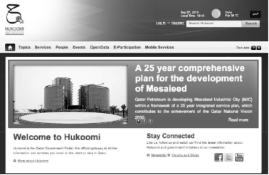
Figure 8 Website of Hukoomi
Source: http://portal.www.gov.qa, September 2013
First, they have conducted usability tests in 2009 and organized user focus group with the primary audiences for Hukoomi. The participants attempted to complete ten of the most common tasks on the site and shared their overall impressions of the site.
In 2012 the portal was redesigned. The redesign of the new government portal involving a highly interactive information architecture workshop with stakeholders, card sorting exercise and prototype development.
The project started using the following methods:
- Gathering client requirements;
- data analysis and review of the existing homepage;
- 285/286 -
- highly interactive Information Architecture workshop was conducted involving key stakeholders in Qatar;
- card sorting exercise was conducted involving key stakeholders in Qatar;
- subsequently, wireframes and prototypes were developed and tested with the targeted profiles of users.
3.6. Saudi National e-Government Portal: developing with number of user test
While developing the site, a number of user tests were conducted to help glean some important insights into the behaviour and expectations of users. This approach is passive in that they did not directly ask the users about what they want or like, but rather gave them exercises and asked them to write down any and all important observations. A more traditional focus group was also conducted.
Activities covered include:
- Card sorting based on the data from the aforementioned analysis;
- user testing for the current design to avoid repeating the same mistakes;
- testing wireframes designed based on the analysis.
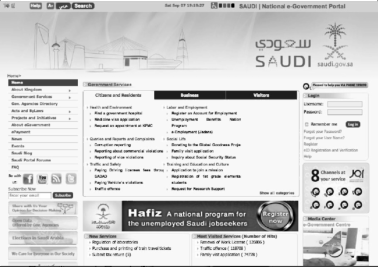
Figure 9 Saudi National e-Government Portal, English version
Source: http://saudi.gov.sa, September 2013
- 286/287 -
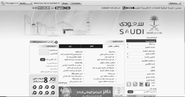
Figure 10 Saudi National e-Government Portal, Arabic version
Source: http://saudi.gov.sa, September 2013
4. Afterword
The examples presented in this study show that the websites of the governments and city governments do not work without the systematic user testing, particularly the investigation of the mental models. The pages/websites that take into consideration the thinking patterns of the users are easier to use because they satisfy better the users' expectations and mentality.
The examples reflect the 2012-2013 conditions. Most of the sites have been, since developed, redesigned, some even totally. But they are still instructive in 2015, considering the methodologies used at that time, and they are exceptional within the Hungarian public administration sites.
During the development of the pages studied, designers and developers implemented the following types of research:
- Analysis of web analytics, e.g. Google Analytics, in order to learn about the former and present behaviour and needs of the user;
- preparing online survey research;
- analysing results in order to map user needs;
- highly interactive Information Architecture workshop was conducted involving key stakeholders;
- doing card sorting tests during development; the test supports the design of the information architecture;
- preparing A/B tests, which help developers pick the one that is more simple and easy to use from two options;
- developing wireframes and prototypes and testing with the targeted profiles of users;
- product analytics, highlighting explicit and implicit user feedback.
- 287/288 -
The examples reflect the 2012-2017 conditions. Most of the sites have been developed since, some even totally redesigned. Considering the harmful development practices that are sometimes found - not only - in Hungary, e.g. the procedure of development is outdated and poorly planned, no or very little testing is done, and even when it is done, it is unprofessional; usability experts/researchers are typically not consulted (due to the lack of information about the theme rather than bad intentions), the earlier development and testing experiences can also be useful and the sites presented in this study are still instructive in 2018, and considering the methodologies used at that time, they are exceptional within the public administration sites.
Köszönetnyilvánítás
Köszönöm a kormany.hu-nak, Budapest 13. kerületének, a gov.uk-nek, Bologna önkormányzatának, kifejezetten Pina Lallinak és Leda Guidinek a készséges segítséget és támogatást. Köszönettel tartozom családtagjaimnak is, akik, mint ahogy minden kutatásom során, ez alkalommal is csendes türelemmel tolerálták az elfoglaltságomat. És kifejezett köszönettel tartozom Págány István(t) mérnök ezredesnek, aki minden tudományos munkámat a legnagyobb türelemmel olvasta végig és látta el hasznos kommentekkel és javításokkal.
- 288/289 -
References
1. Craik, Kenneth: The Nature of Explanation, Cambridge University Press, Cambridge, 1967. Available: www.amazon.com/dp/0521094453/ref=cm_sw_su_dp (Downloaded: 11.02.2018.)
2. Herendy Csilla: NKE WUD 2015 Usability and Research in Public Administration. (Presentation.) Available: http://archiv.akk.uni-nke.hu/uploads/media_items/nke-wud2015_herendy-csilla-ppt.original.pdf (Downloaded: 11.02.2018.)
3. How to align with your user's mental model. Available: http://uxoslo.com/2014/01/14/ux-hints-why-mental-models-matter/ (Downloaded: 08.22.2015.)
4. Nielsen, Jakob: Mental models, 2010. Available: www.nngroup.com/articles/mental-models/ (Downloaded: 08.22.2015.)
5. Nielsen, Jakob: Top 10 Information Architecture (IA) Mistakes, May 11, 2009. Available: www.nngroup.com/articles/top-10-ia-mistakes/ (Downloaded: 11.02.2018.)
6. Norman, Donald A.: Emotional Design: Why We Love (or Hate) Everyday Things, Basic Books, New York, 2004.
7. Rung, Andras: Paper prototype fidelity. Available: http://ergomania.eu/paper-proto-type-fidelity/ (Downloaded: 11.02.2018.)
8. Spencer, Donna: Card Sorting: Designing Usable Categories, Rosenfeld, Brooklyn, New York, 2009.
9. Young, Indi: Mental models. Aligning Design Strategy with Human Behavior, Rosenfeld Media, LCC, 2008.
10. Weinschenk, Susan, Ph.D.: 100 Things Every Designer Needs to Know About People, New Riders, 2011.
11. Weinschenk, Susan, Ph.D.: The Secret to Designing an Intuitive UX: Match the Mental Model to the Conceptual Model. Psychological concepts underlying good user experience and usability.
12. Available: https://uxmag.com/articles/the-secret-to-designing-an-intuitive-user-ex-perience (Downloaded: 23.08.2015.)
Csilla Herendy PhD (herendy.csilla@uni-nke.hu) graduated in 2000 at the Eszterházy Károly College at the Department of Visual Communication, in 2002 at the Corvinus University of Budapest at the Faculty of Public Administration (today: National University of Public Service) and in 2006 at the University of Pécs, at the Department of Communications. She defended her doctoral thesis in 2012.
She used to work at the press office of the Mayor's Office, Budapest and at RTL Klub Online. She worked as a Team Leader at Morpho Communications PR agency. She has been a lecturer at the former University of Public Administration since 2002, and from 2012 Adjunct Lecturer at the National University of Public Service. Currently, besides her university teaching and research work, she has domestic and international UX research assignments. Her field of research is the examination of online communication, visual, usability and navigation issues related to online surfaces. ■
NOTES
[1] Available: http://archiv.akk.uni-nke.hu/uploads/media_items/nke-wud2015_herendy-csilla-ppt.original.pdf (Downloaded: 11.02.2018.)
[2] Available: www.usabilitynet.org/management/b_what.htm and www.usabilitynet.org/tools/r_international.htm (Downloaded: 11.02.2018.)
[3] Available: www.uxbooth.com/articles/what-on-earth-is-iso-9241/ (Downloaded: 11.02.2018.)
[4] Craik, Kenneth: The Nature of Explanation, Cambridge University Press, Cambridge, 1967. Available: www.amazon.com/dp/0521094453/ref=cm_sw_su_dp (Downloaded: 11.02.2018.)
[5] Weinschenk, Susan, Ph.D.: The Secret to Designing an Intuitive UX: Match the Mental Model to the Conceptual Model. Psychological concepts underlying good user experience and usability. Available: https://uxmag.com/articles/the-secret-to-designing-an-intuitive-user-experience (Downloaded: 11.02.2018.)
[6] Weinschenk, Susan, Ph.D.: 100 Things Every Designer Needs to Know About People, New Riders, 2011, 72.
[7] Young, Indi: Mental Models, Rosenfeld Media, 2008, 2.
[8] Nielsen, Jacob: Mental Models. Available: www.nngroup.com/articles/mental-models/ (Downloaded: 11.03.2018.)
[9] Nielsen, Jacob: Top 10 Information Architecture (IA) Mistakes, May 11, 2009. Available: www.nngroup.com/articles/top-10-ia-mistakes/ (Downloaded: 11.02.2018.)
[10] Spencer, Donna: Card Sorting: Designing Usable Categories, Rosenfeld, Brooklyn, New York, 2009, 5.
[11] Ibid. 7.
[12] Available: http://ergomania.eu/paper-prototype-fidelity/ (Downloaded: 11.02.2018.)
[13] Available: http://real-j.mtak.hu/5606/1/JelKep_2011_1.pdf (Downloaded: 11.02.2018.)
Lábjegyzetek:
[1] The auhor is PhD, Adjunct Lecturer, Senior UX Researcher, Trainer, National University of Public Service, University of Pécs, herendy.csilla@uni-nke.hu.